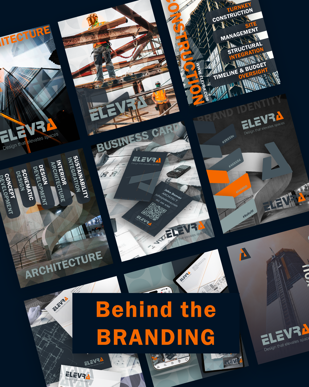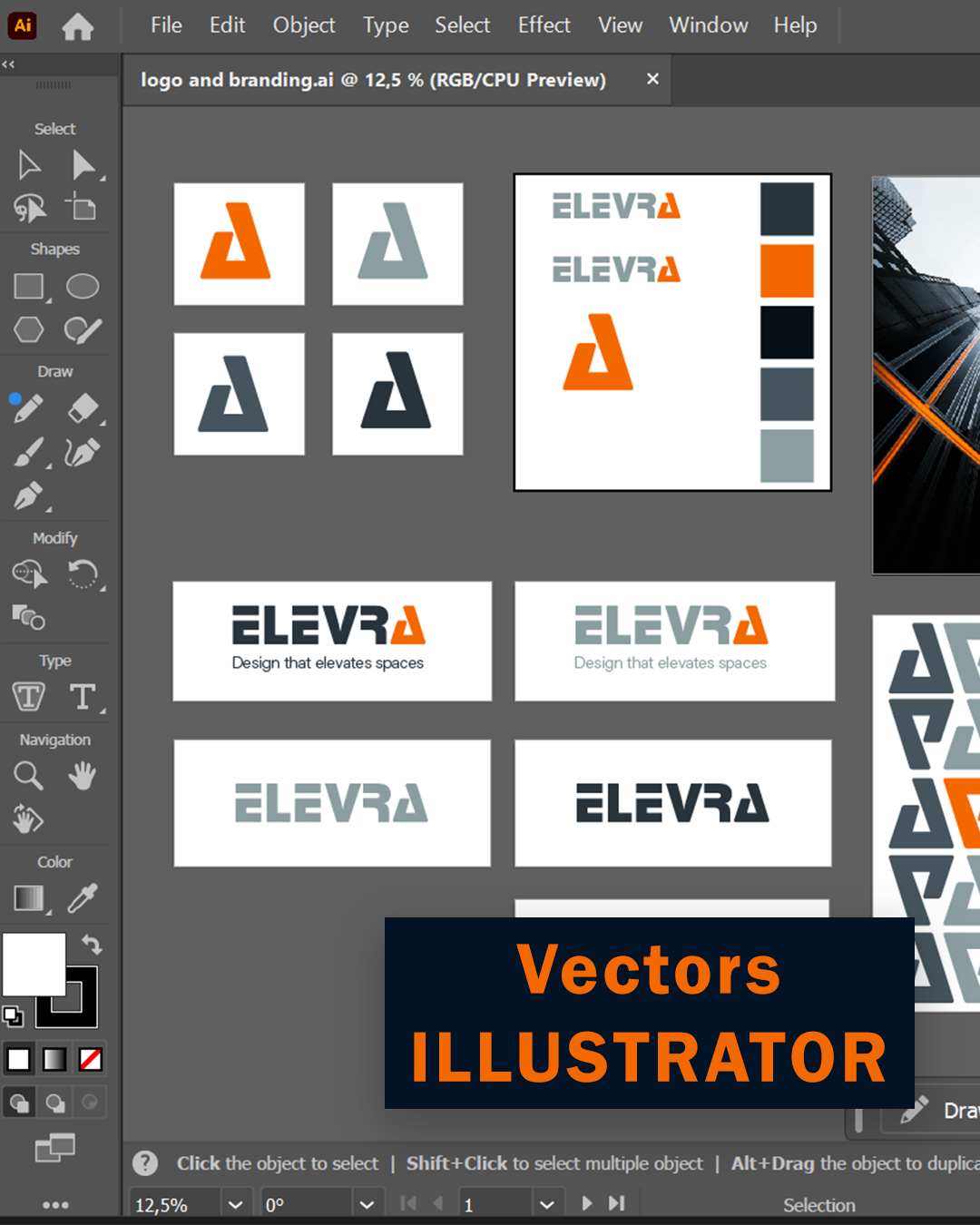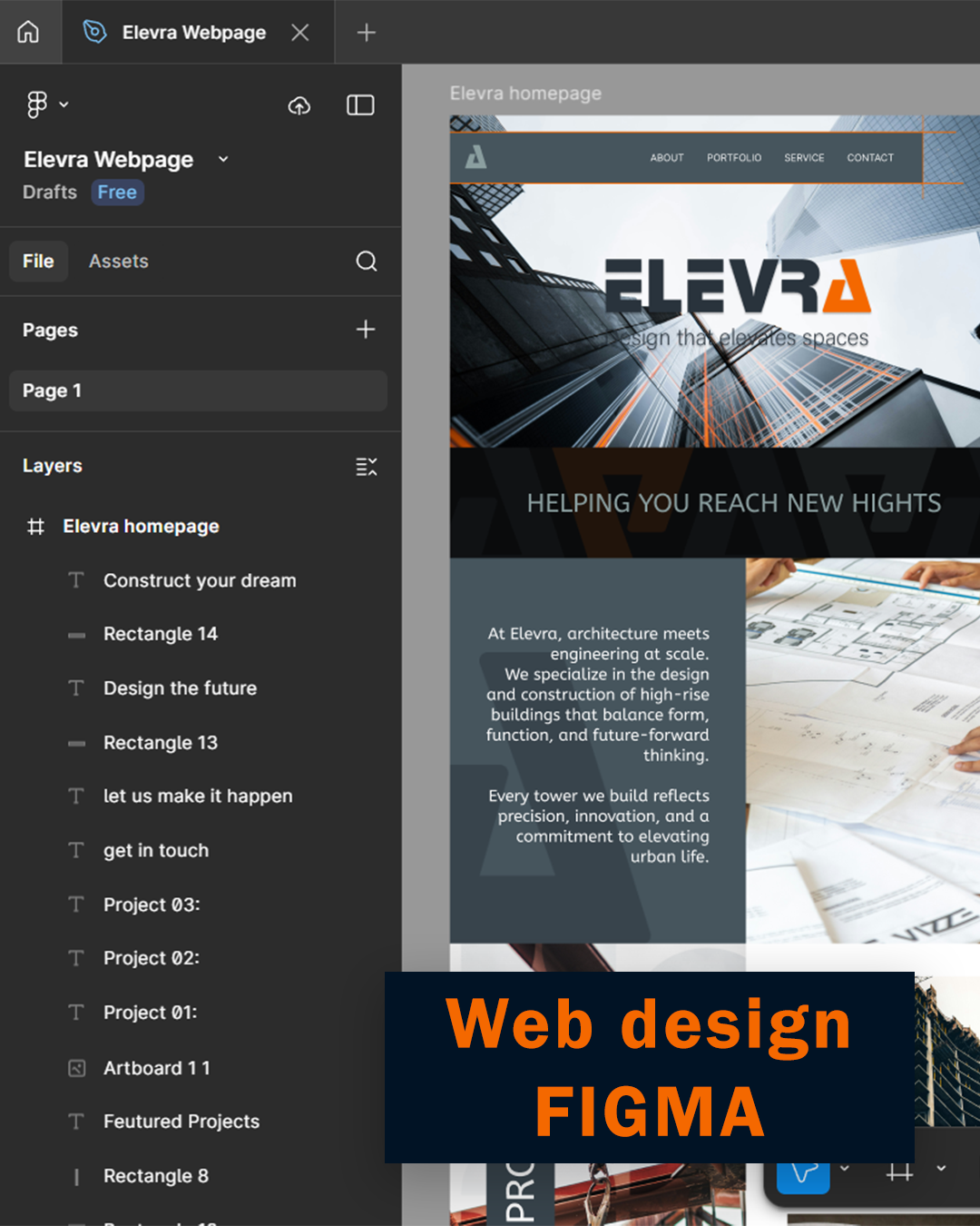
The design and ideas came from one photograph. Incorporating the bold orange colour and strong typography and using the "A" as a brand asset for the logo. Cause a triangle is the strongest shape of them all.
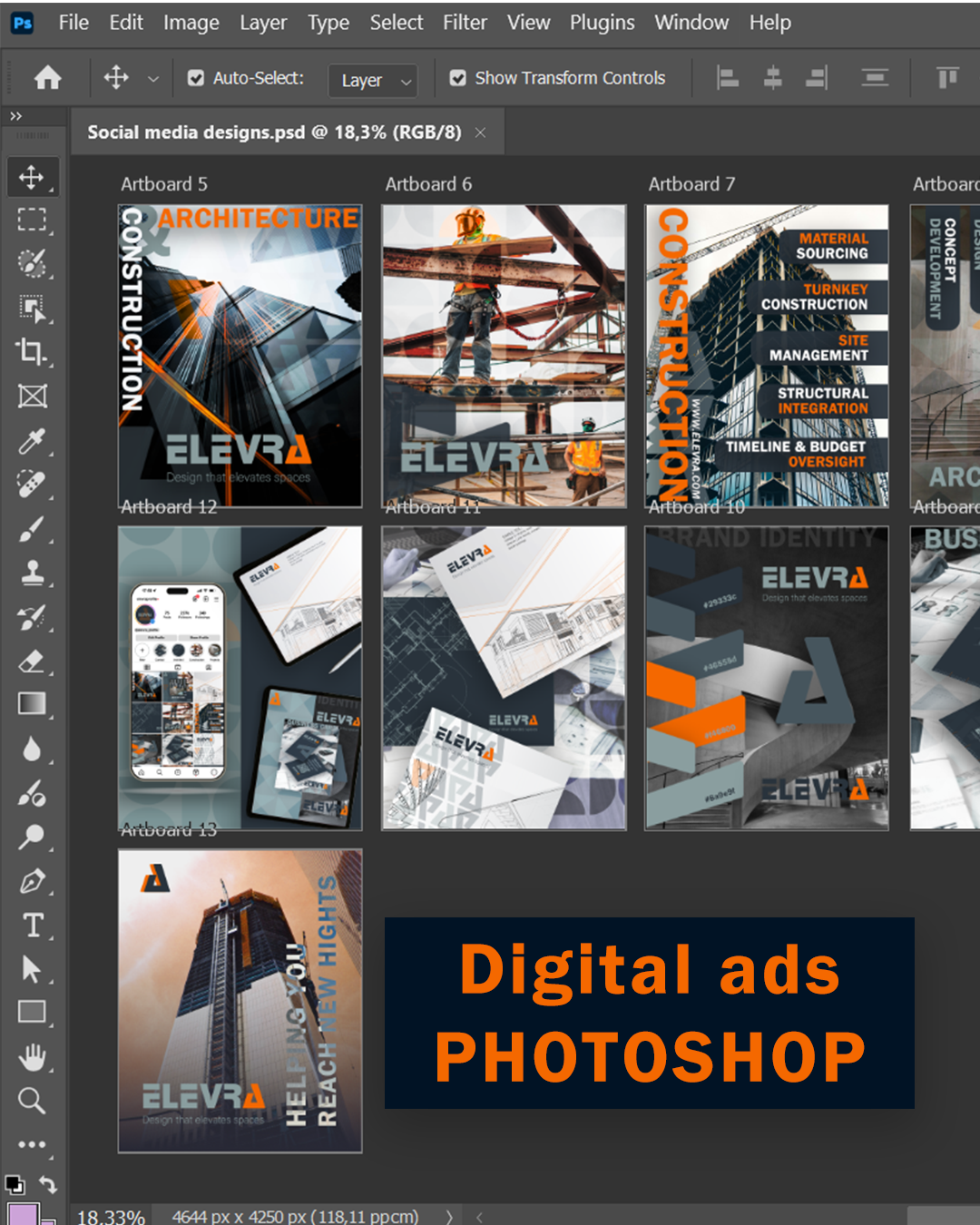
This gives the brand a bold feel and showcases what the company stands for. Bold builds, strong structures and modern takes on design well still thinking of our eco-system.
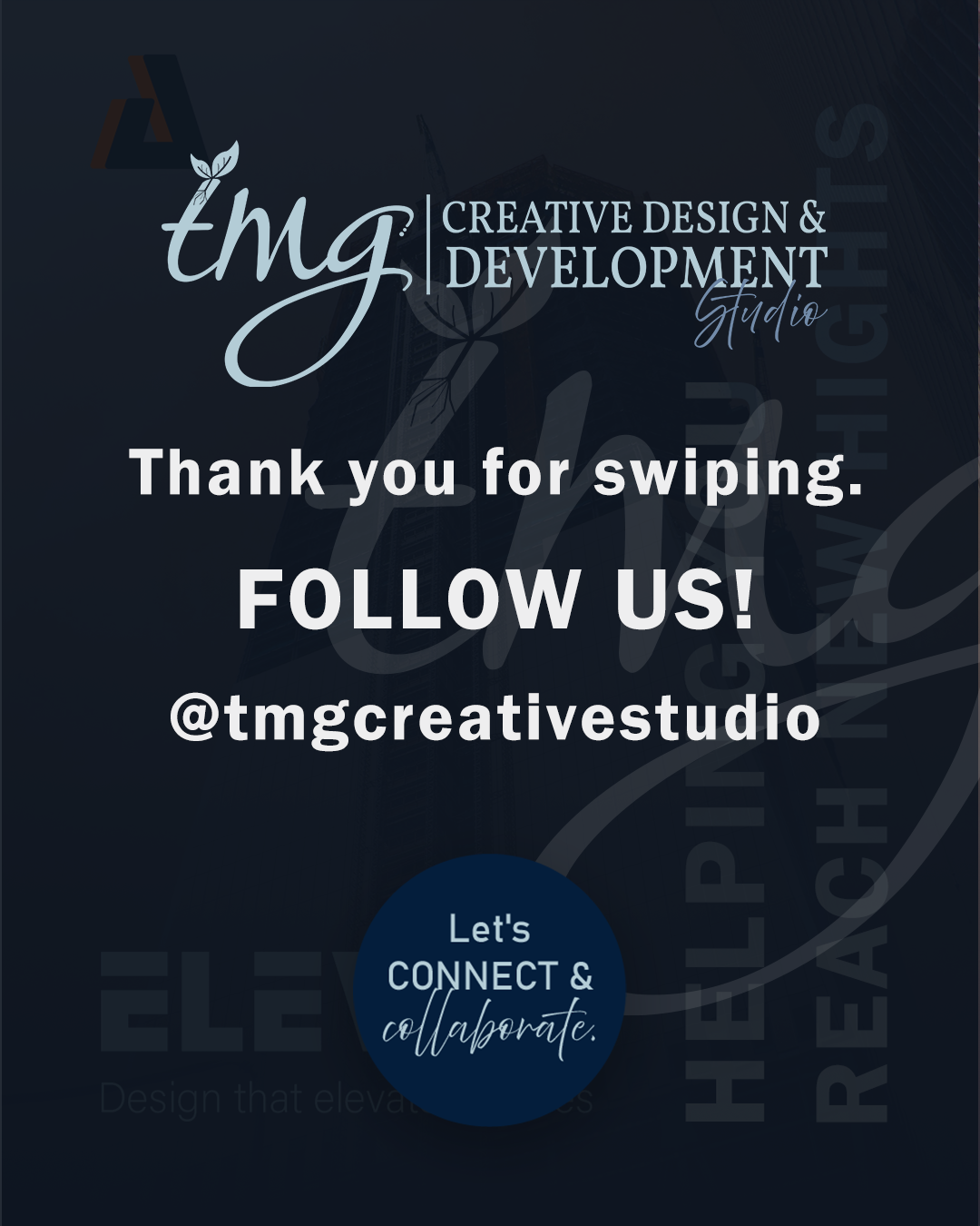
Thanks for the support and be sure to follow us for more.🤗
Brief by @thenewbrief
This gives the brand a bold feel and showcases what the company stands for. Bold builds, strong structures and modern takes on design well still thinking of our eco-system.
Thanks for the support and be sure to follow us for more.🤗
Brief by @thenewbrief