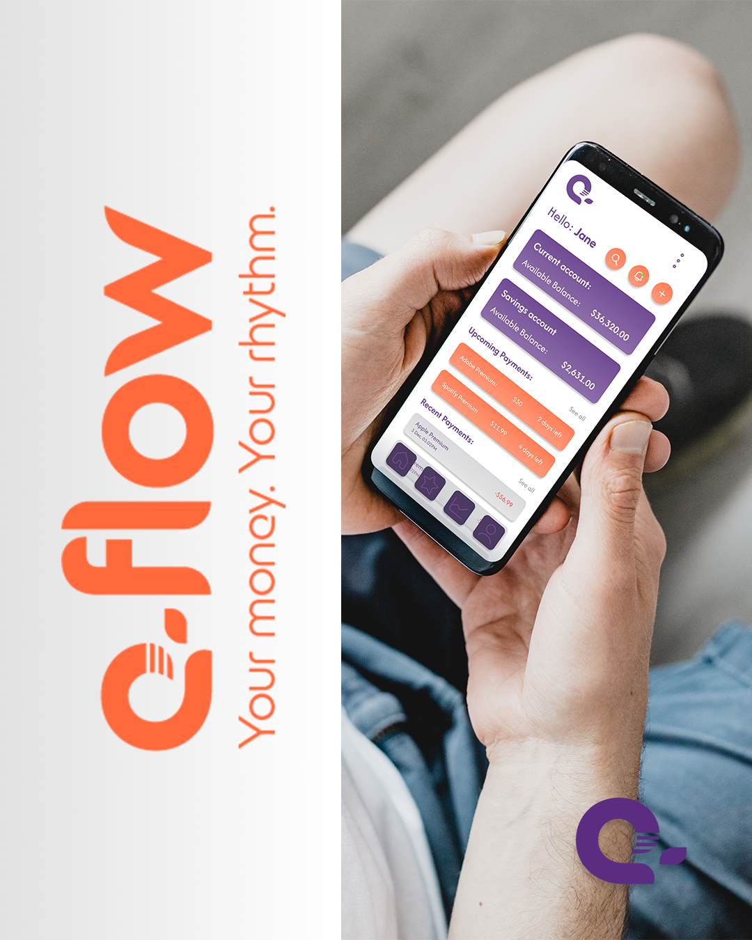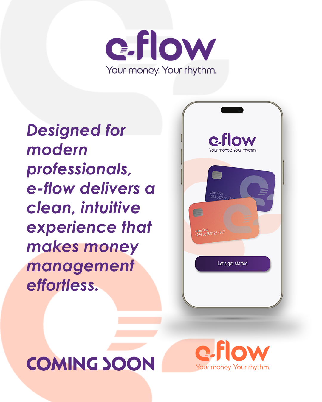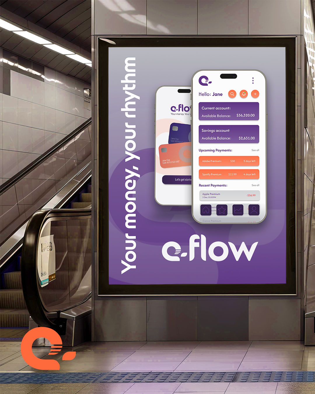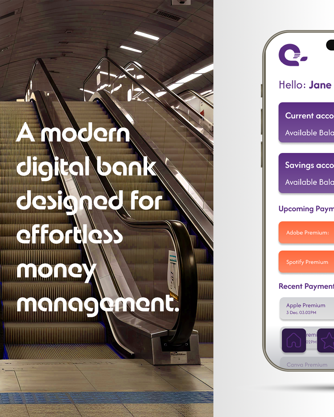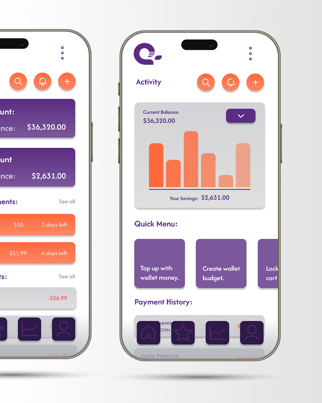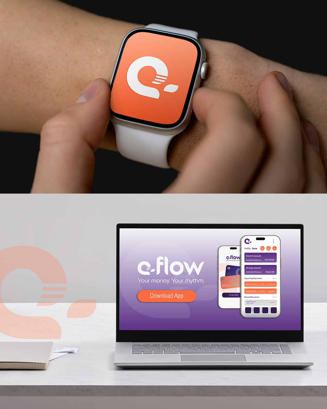
For e‑flow, I developed a sleek, modern, and clean digital‑banking experience built around clarity, speed, and intuitive interaction. The process began with defining the brand’s core values and visual language, exploring colour palettes, typography, and iconography that would resonate with young professionals seeking a frictionless way to manage their money. From there, I crafted a cohesive identity system and translated it into a streamlined UI, focusing on simple navigation, balanced spacing, and effortless user flows. Each screen was designed to reduce cognitive load and highlight the most important actions, resulting in a banking platform that feels calm, confident, and beautifully easy to use.